Bizkaia talent upgrades its website design to make it more accessible and dynamic
2016/06/23
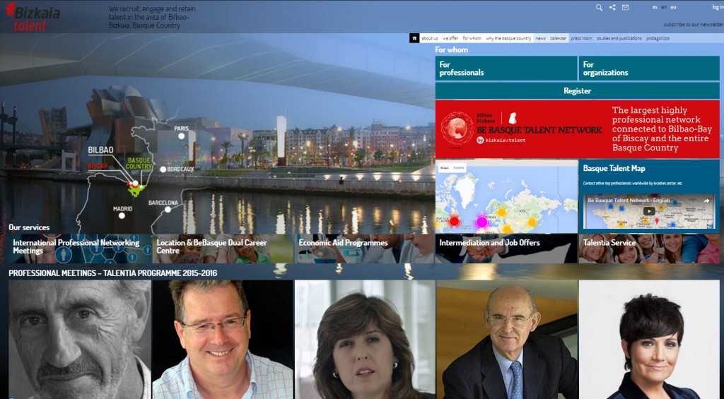
Bizkaia talent, being aware of the importance of enhancing and streamlining its website users’ browsing experience, has re-designed the site to make it more accessible and dynamic.
One novel feature is that bizkaia talent’s services appear at the beginning of the landing page, so that users can find out information and do what they need to do without being obliged to go into the menus.
And recently, a specific area has been created for advertising and promoting the activities and events that are taking place. The first use made of this area was for the Meetings of Professionals held as part of the Talentia Programme. Thus, the participants in this initiative were able to look up the dates of the lectures and the personal biographies of the featured speakers.
What’s more, users can now see at a glance the news items, diary and latest videos published. Now users can take in more at one go.
Also, the home page now includes content about where we’re heading, about us, and about the Basque Country’s “signs of identity”. This part of the website also includes a new area devoted to some of the Basques whose names have gone down in history.
At bizkaia talent, multimedia content is steadily gaining importance, therefore we’ve created a new section entitled “protagonists” (key players) where highly-skilled professionals and well-known figures involved in the organization explain, in televised-interview format, their ideas and opinions about talent and the Basque Country.
Another novel feature is users’ ability to sign up for the bizkaia talent newsletter with the option to select their areas of interest.
So that you don’t miss a thing, take a peek at the new bizkaia talent website. Now with the new .eus (for Euskadi) extension, more functions and a new look!


